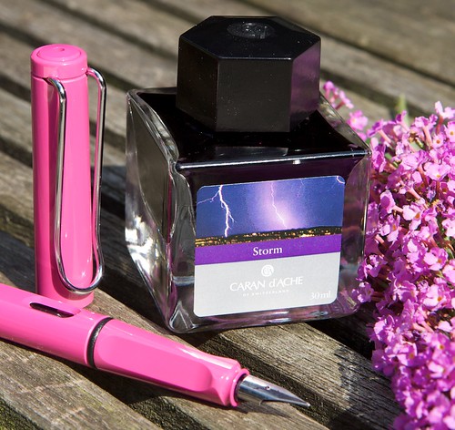
 I bought this beautiful glass bottle from Art Brown International Pen Shop. Caran ' d Ache was inspired by the colors of the earth. They have nine beautiful colors. Not all are Moleskine-friendly but this amazing color is!
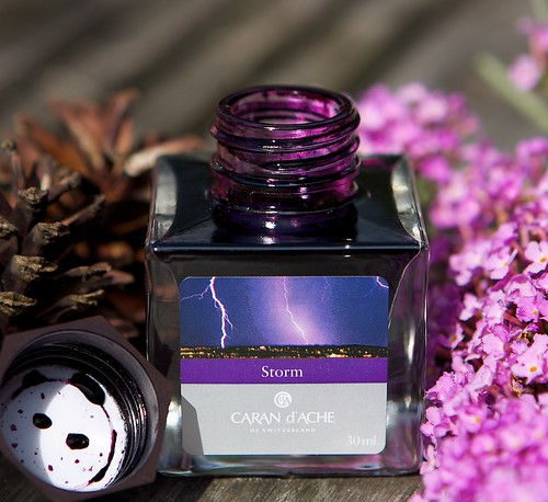
Color
The color is quit distinctive. Not to shiny. But it is a nice deep purple. I think it can be used for businesspeople. The ink has a very nice shading.
Writing
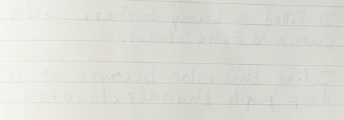
The ink just flows very fine in a Lamy Safari (fine). It also does the job just fine in a Montblanc 146 (fine nib). It writes smooth and dries quickly on Moleskine paper. On Rhodia it dries even faster. The ink does on Moleskine paper a little bit of feathering. But don't let that stands in the way of buying this great ink. The feathering is very minimal. In combination with Lamy Safari the ink does not bleedtrough the Moleskine paper.
Written report
In the written report I wrote:
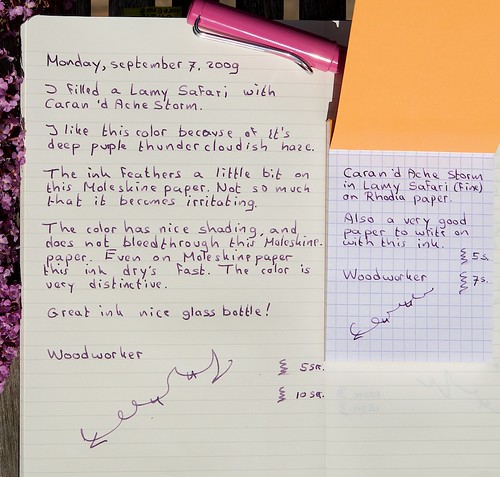
"Monday, september 7, 2009
I filled a Lamy Safari with Caran 'd Ache Storm.
I like this color because of it's deep purple thundercloudish haze.
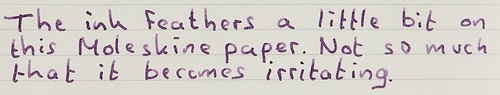
The ink feathers a little bit on this Moleskine paper. Not so much that it becomes irritating.
The color has nice shading, and does not bleedthrough this Molesskine paper. Even on Moleskine paper this ink dries (misspelled on paper ;-D) fast. The color is very distinctive.
Great ink, nice bottle!
Woodworker"
Moleskinefriendly
Yes this ink can be given the label Moleskinefriendly-fountainpen-ink. Their are some very tiny spots that bleedtrough. But writing on the other site does not make a mess of the pages.
Caran d’Ache inks: all the colours of the Earth
Caran d’Ache is drawing on its expertise and mastery of colour to offer all lovers of handwriting a collection of inks in nine original tints. Caran d’Ache inks offer the natural colours of the earth in a rich assortment that ranges from sombre to tender to vivacious. They are a source of inspiration, expressing a mood, adding an emotional dimension to words, or marking a special moment. With nine original, bright tints, each feeling finds its own nuance and the pen plays in perfect harmony.


2 comments:
Hi!
I just want to make a quick note to say that inks that work today in a Moleskine, may not work tomorrow... Moleskine paper is inconsistent from book to book and sometimes within one single book. (It's because they are not in the paper business) I myself went round and round trying to find inks that worked in my Moleskine when I finally came to the conclusion that I should just buy a product that uses a higher quality paper so I can use any ink I like without fearing feathering, spreading or bleedthrough. Clairefontaine has been making their own paper for decades and whether it's in the Clairefontaine noteboks, or the Rhodia products, it's always consistent in it's quality. If you like the Mole's design, look at teh Rhodia Webnotebook - it's quite similar but with better paper. :o)
Hi,
I love your blog and the reviews you post on inks! I'd just like to direct you to the Kokuyo brand of papers, notebooks and notebook covers (which would be very similar to Moleskine). The paper that Kokuyo uses is far superior to Moleskine, and IMHO a mite better than Clairefontaine in terms of texture (I'm not a fan of ultra-smooth dazzling white paper). It does well with every fountain pen ink I've tried, and does not seem to absorb hand oils as badly as Clairefontaine. I'm not sure if they are available in the Netherlands, but you can definitely buy some at jetpens.com. No affliations, etc.
Post a Comment